转自(http://www.xincss.com/?p=221)
这篇文章将简述使用CSS3的border-radius来画圆、半圆和四分之一圆,并如何利用它们。
如何使用border-radius属性
下面是border-radius属性最基本的使用方法。
关于在IE里怎么实现圆角,可以看《Excellent Article Which Included Ways to Achieve Rounded Corners in IE》这篇文章。
1.用border-radius画圆
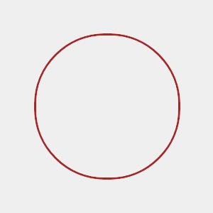
实心圆

如图,是用border-radius属性画出来的一个完美的实心圆。画实心圆的方法是高度和宽度相等,并且把border的宽度设为高度和宽度的一半。代码如下。
空心圆
通过border-radius属性画空心圆和画实心圆的方法差不多,只是border的宽度只能小于高度和宽度的一半。代码如下。
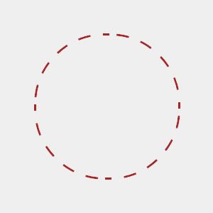
虚线圆
2.半圆和四分之一圆
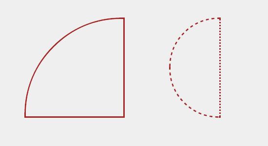
半圆

以本例来讲,半圆的画法是把宽度设为高度的一半,并且也只设置左上角和左下角的半径。代码如下。
四分之一圆

四分之一圆的实现方法是把高度和宽度设置为相等,只设置一个圆角,其半径等于高度或宽度。本例代码如下。
更多玩法
看了这么多实例后,你完全可以自己创造更多玩法,如:
虚线的半圆和四分之一圆。

配合position属性做一个月亮。

配合position、RGBa和z-index这些属性做一个本文开头的色彩维恩图。
-
« 上一篇:
JDK+Myeclipse+Tomcat安装步骤教程
-
svn搭建
:下一篇 »